Have you noticed how tight all of Munster’s games — well, most of them — have been this season? Not necessarily on the scoreboard, but in a general “vibe”?
I have, and I hate vibes. I like to see things clearly, in black and white, so I wanted to use this week’s Net Efficiency article to dive into that feeling ahead of Castres.
Using my Net Efficiency metrics, I will illustrate why that feeling of most games — either in the moment, or looking back — feels like they’ve been so finely balanced.
Let’s get into it. I’ve also included a few definitions to help newer subscribers to this tier catch up on some of the language.
Table/Chart 1: Net Efficiency (NE)
What it is
When Munster enters the 22, how effective are we at converting it into points compared to the other team?
It’s based on Points Per Entry (PPE):
An entry = a meaningful visit to the opposition 22.
PPE = how many points you score, on average, per entry.
NE = Munster PPE − Opponent PPE
How to read it
NE is positive (+) → Munster are more clinical than the opponent when each team gets chances.
NE is negative (−) → the opponent are more clinical than Munster.
What it does not tell you
It doesn’t tell you how many chances you created. You can be “more clinical” but still lose if you barely got into the 22.
Simple example
Munster PPE 3.0, Opp PPE 1.7 → NE +1.3
Meaning: “Per red-zone visit, we got 1.3 more points than they did.
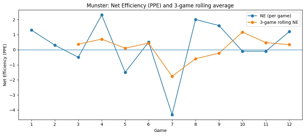
Rolling Net Efficiency
G
Opp (H/A)
PPE (M-O)
NE
3g NE
1
Scarlets (A)
3.0–1.7
+1.3
2
Cardiff (H)
2.8–2.5
+0.3
3
Edinburgh (H)
1.8–2.3
-0.5
+0.37
4
Leinster (A)
3.5–1.2
+2.3
+0.70
5
Connacht (H)
1.5–3.0
-1.5
+0.10
6
Stormers (H)
3.0–2.5
+0.5
+0.43
7
Bath (A)
1.4–5.7
-4.3
-1.77
8
Gloucester (H)
2.0–0.0
+2.0
-0.60
9
Ospreys (A)
3.2–1.6
+1.6
-0.23
10
Leinster (H)
1.0–1.1
-0.1
+1.17
11
Ulster (A)
1.5–1.6
-0.1
+0.47
12
Toulon (A)
3.1–1.9
+1.2
+0.33
What “rolling net efficiency” means
It’s just a smoothing filter. Instead of judging Munster on one game (which can be noisy and give you a bad read), you take the average Net Efficiency across the last 3 games to see the trend.
Net Efficiency in a single game
NE (game) = Munster PPE − Opponent PPE
Example:
Munster PPE 3.0, Opp PPE 1.7 → NE = +1.3
That means: per 22 entry, Munster got 1.3 more points than the opponent did.
The rolling 3-game average
For game N, the rolling NE is:
Rolling NE (Game N) = (NE in Game N + NE in Game N−1 + NE in Game N−2) ÷ 3
So the rolling line only starts at Game 3 (because you need 3 games to average).
Concrete example using 3 games from this season
Game 1 NE = +1.3
Game 2 NE = +0.3
Game 3 NE = −0.5
Meaning: Across those three 3 matches, Munster were about +0.37 points-per-entry better than opponents on average.
How to interpret the rolling line
Rolling NE above 0 → over the last 3 games, Munster have been more clinical per entry than opponents.
Rolling NE below 0 → over the last 3 games, opponents have been more clinical per entry.
Why it’s useful
One freak result (good or bad) can distort your view. Rolling NE reduces the “one-match overreaction” and shows whether the attack/defence finishing trend is improving or slipping
The catch
Rolling NE can lag reality, though. If you have one disaster game (like Bath), the rolling average stays poisoned for two more games, even if you improve immediately afterwards.
Quick Read
Think of it like form:
Per-game NE = “how we were tonight”
Rolling 3-game NE = “how we’ve been lately”
Munster’s 22-entry Net Efficiency this season tells a pretty clear story: when we get into the red zone, we’re usually finishing better than the team in front of us — but the swings from week to week are huge. Across 12 matches, we’re positive on NE more often than not, with big “clinical” performances away to Leinster and at Ospreys showing what it looks like when we convert entries at a higher rate while also limiting opposition return.
The outlier is Bath, where the NE collapses and drags the rolling trend line into the red, which acts as a reminder that one game of defensive and attacking dysfunction inside the 22 can poison the model for multiple weeks. Since then, the rolling average steadies back towards (and slightly above) zero, which is basically the season in miniature: the underlying finishing on chances is competitive, but our week-to-week reliability inside the 22 — especially defensively — is still the difference between looking like a top-four side and taking a step backwards.
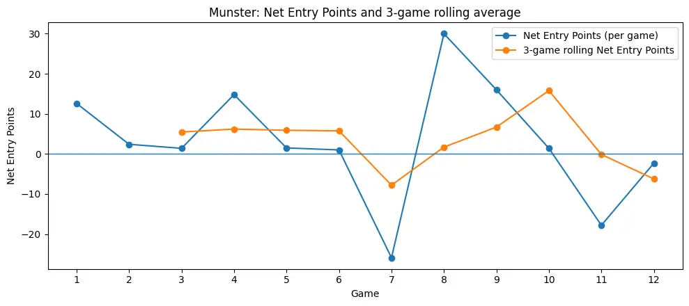
Net Entry Points
G
Opp (H/A)
EP For
EP Ag
Net EP
3g Net EP
1
Scarlets (A)
33.0
20.4
+12.6
2
Cardiff (H)
22.4
20.0
+2.4
3
Edinburgh (H)
19.8
18.4
+1.4
+5.5
4
Leinster (A)
28.0
13.2
+14.8
+6.2
5
Connacht (H)
16.5
15.0
+1.5
+5.9
6
Stormers (H)
21.0
20.0
+1.0
+5.8
7
Bath (A)
14.0
39.9
-25.9
-7.8
8
Gloucester (H)
30.0
0.0
+30.0
+1.7
9
Ospreys (A)
25.6
9.6
+16.0
+6.7
10
Leinster (H)
8.0
6.6
+1.4
+15.8
11
Ulster (A)
3.0
20.8
-17.8
-0.1
12
Toulon (A)
18.6
20.9
-2.3
-6.2
Rolling Net Entry Points is the cleanest read on whether we’re actually controlling games, because it bakes in both the number of entries we create and what we do with them. Early on, the rolling line sits comfortably in the positive — we’re edging the 22 entry economy by roughly +5 to +6 net entry points per game over three-match blocks — before Bath blows the trend and drags the rolling number sharply down. That game felt bad, and it was bad.
The important bit is what happens next: Gloucester and Ospreys don’t just “look better” on the eye, they yank the rolling Net EP back up hard, because we’re stacking entries and starving the opposition at the same time.
But the late dip is the warning sign: Ulster (and then Toulon) pull the rolling number back towards and below zero, which is what it looks like when we’re either not creating enough entries or conceding too many — even if our per-entry finishing stays broadly competitive. In other words, Net Efficiency tells you how sharp we are per chance; Rolling Net EP tells you whether we’re consistently earning enough chances to make that sharpness matter.
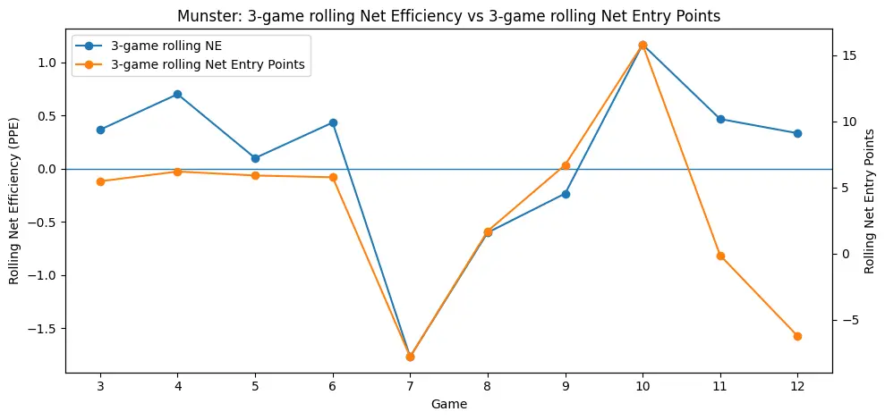
Read them together: what’s the real story?
Munster can “win efficiency” but lose the match if entries fall off
Example: Ulster is basically NE ~ level (-0.1), but Net EP is heavily negative because we only created 2 entries.
Translation: your finishing wasn’t the problem there — our ability to access the 22 is.
When Munster dominate, it’s usually through denial + volume, not just hot finishing
Gloucester (+30) and Ospreys (+16) aren’t just “we took chances.” They’re “we locked the opposition out of the 22 AND scored relatively efficiently.”
The season volatility is coming from two failure modes
Conversion collapse (Bath): you lose NE and Net EP catastrophically.
Entry creation collapse (Ulster, and to a lesser extent, Toulon): NE is survivable, Net EP still goes negative because we’re simply not generating enough chances.
The blue line says we’re generally good when we get chances; the orange line says we’re not always getting enough chances — and that’s why matches swing even when our 22 efficiency holds up.
When entries and points diverge, that’s where longer-range penalties and conversions have a real impact.
What “good form” looks like on that graph
Orange stays clearly above zero (Net EP)
This is the big one. A good run means you’re winning the 22 economy over three-game blocks:
You’re earning more entries
You’re conceding fewer
And you’re banking more total entry value than the opposition
Rule of thumb:
+5 to +10 rolling Net EP = strong, repeatable control
+10+ = you’re putting teams away (dominance)
Around 0 = coin-flip rugby: small details decide results
Blue stays above zero (NE) — but it doesn’t need to be huge
A good run usually has Rolling NE positive because that means you’re not wasting chances and you’re not leaking points-per-entry defensively.
Rule of thumb:
+0.3 to +0.8 rolling NE = healthy clinical edge
+1.0+ = you’re really sharp per entry (often a hot streak)
Negative blue over a block means you’re either blunt in the 22 or soft when teams get there.
The best-case shape: orange rising, blue steady
The “top team” pattern is:
Orange rising or stable-high (control + volume)
Blue stable-positive (conversion + defensive resilience)
That’s Gloucester/Ospreys-type territory control, but sustained against higher-level opponents.
What a bad run looks like
Orange below zero = you’re losing the territory/chances battle. Even if you finish OK, you’re playing on the wrong end of the pitch.
Blue below zero = you’re also losing the finishing battle — that’s how you get blowouts (Bath-type weeks).
Blue positive but orange negative = “we took our chances, but we didn’t play in their 22 enough” — you’ll get narrow losses or ugly wins.
This is how I’d describe a good three-game block;
Rolling Net EP comfortably positive (ideally +5 or more) and Rolling NE positive (ideally +0.3 or more).
That combination would say: we’re getting enough chances, and we’re doing more with them than the other team.
The signal running through it: Munster are “roughly break-even” on tries-per-entry over the run
We’re basically ~33% scored vs ~33% conceded across the sample — so the swing games (Bath, Connacht conceded %, Cardiff conceded %) matter disproportionately. That aligns perfectly with the two charts: one or two spikes distort the whole season profile.
To get into the weeds on it, we are scoring slightly more tries than we’re conceding per entry across the first 12 games of the season, which adds to the idea that all our games have been so tight. But it goes deeper than that, as I’ll explain below.
TL; DR
Munster’s attack is not fundamentally inefficient inside the 22 — NE is positive more often than not. The bigger challenge is reliably earning entries, especially away and/or versus teams that can pin us and force long-field exits. But our chance creation combined with conversion is the biggest limiter on our season so far. Defensively, we’re doing really well, but we’re not converting enough, and as of late, we haven’t been creating enough.
Across the 12 games, Munster’s 22 entries go 11, 8, 11, 8, 11, 7, 10, 15, 8, 8, 2, 6. In trend terms, it’s not a clean rise or fall — it’s mostly stable in the 8–11 range for the first ten matches (with one spike to 15 vs Gloucester and one dip to 7 vs Stormers), and then it drops sharply in the last two away games (2 vs Ulster, 6 vs Toulon). Put simply: through the first 10 games, we’re averaging 9.7 entries per match, but the last two are 4.0, so the overall picture is slightly down, driven almost entirely by that late collapse in entry creation rather than a steady season-long decline.
The season’s biggest “process KPI” isn’t just PPE — it’s entries-for. When entries collapse (Ulster), the model says we lose regardless of “finishing.”
Defensively, the priority is preventing opponent entry quality spikes (Bath being the obvious example): once a side is converting at extreme rates, it blows up both NE and Net EP and takes multiple weeks of good work to wash out of rolling averages. Outside of that, we’ve generally been quite good. More than decent.
Across the 12 games, Munster’s defensive 22 entries allowed go 12, 8, 8, 11, 5, 8, 7, 2, 6, 6, 13, 11. The trend is down (better) through the middle of the season — we move from regularly conceding 8–12 entries early on to a really strong patch where we’re holding teams to 7, then 2 (Gloucester), then 6 and 6 — but it spikes badly in the last two away games (13 vs Ulster, 11 vs Toulon). In other words: the season-long average is about 8.1 defensive entries per game, but the last two matches jump to 12 per game, which suggests the recent wobble isn’t a gradual drift — it’s a late, sharp loss of territorial/exit control and red-zone denial.
So, in short, why does it feel like games are so tight? Across the season, so far, we’re only earning +0.6 more 22 entries than the opposition on average, while only being +2.9 entry-points better. A kick of a ball, often enough.
That’s the margin, and it needs to get bigger if we’re to have a better run.